Curanse
Wellbeing begins with a coherent identity.
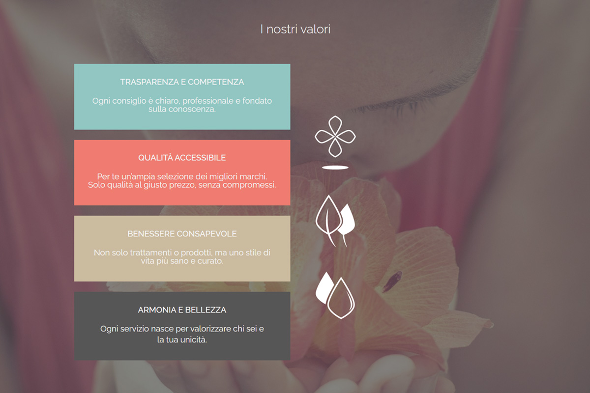
The idea
Curanse is a wellness brand that brings together a para-pharmacy, beauty services and hair care within a single visual identity. The project aimed to transform an existing logo into a complete brand system capable of growing across different services and environments.
The project
Rather than redesigning a logo, the objective was to build a brand architecture that could connect different areas of the business while preserving a clear and recognizable identity.
A monolithic brand system was developed, supported by dedicated colour palettes for each division: para-pharmacy, beauty and hair care. This created consistency without sacrificing personality.
The project extended beyond digital touchpoints, shaping the customer experience through the website, retail communication, window graphics and interior visual elements.
Selected outputs
What took
shape.
- Logo Redesign
- Brand Identity System
- Color Palette
- UX/UI Website Design
- Joomla Development
- Window Graphics
- Interior Wall Illustrations
- Retail Visual Communication
The outcome
The result is a flexible identity system that helps Curanse grow consistently across retail, wellness and digital experiences.
Visit Curanse